The Reflowable Ebook
A quick and interactive introduction for editors, designers, and the simply curious
Introduction
We often speak of formats, business models, enrichment or disruption, but we sometimes forget something important: the design of the book.
Over the past few years, I have realized that many publishers and graphic designers are feeling confused.
What is possible, and how?
Can desktop publishing software do this directly?
Why are there layout bugs in a particular reading system?
Can we add interactivity?
What constraints should be taken into account?
These questions are vague, and require clarification.
The object of this page is therefore to be A guide to the reflowable ebook.
Ebooks are from the web
Even if we are not going to delve into the technical details of the ebook and, more particularly, of the EPUB standard, we must remember that ebooks borrow the language of the web.
A digital book in EPUB format is:
- Content in HTML (HyperText Markup Language);
- Laid out with CSS (Cascading Style Sheets);
- Made interactive with JS (JavaScript);
- Vector images in SVG (Scalable Vector Graphics).
The HTML structure looks like this:
<h1>Chapter Title</h1>

<p>The first paragraph of our chapter, the <em>emphasis</em> element emphasizes a word in the phrase.</p>

<blockquote>
 <p>This is the first paragraph of the blockquote.</p>
 <p>And this is the second.</p>
</blockquote>

<figure>
  <img alt="Description of the image" src="../Images/image1.jpg" />
  <figcaption>Caption of the image</figcaption>
</figure>
This structure allows the reading system to understand the text and to differentiate between the various elements (title, quotation, illustration, etc.). This is also used for speech synthesis.
As for the design with CSS…
p {
  font-size: 1em;
  line-height: 1.5;
  margin: 0;
  text-indent: 1em;
}
In this example, we declare styles for all the paragraphs in the book (size, leading, margins, and indentation of the first line).
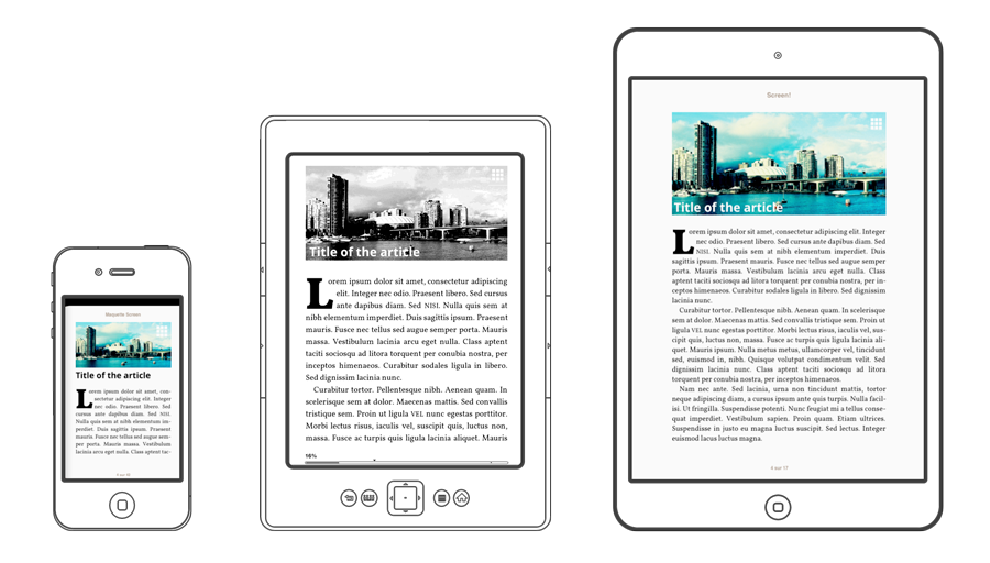
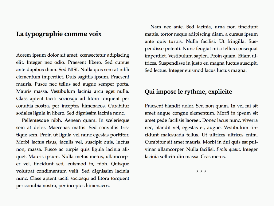
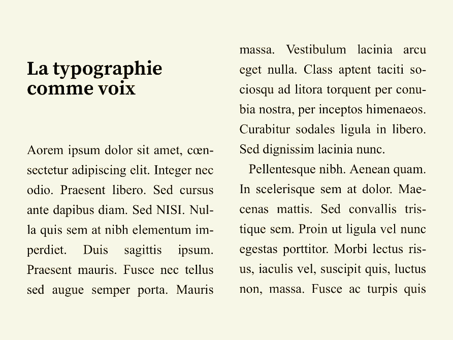
It is important to note that web content is fluid by default: it is automatically reflowed in the browser window. For example, we could compare it to the reflowable text block in InDesign.
It is in styling that one is likely to degrade this fluidity.
There was a time when web designers used fixed dimensions, for example 800 pixels wide. This allowed them to create more complex layouts: columns, pixel-like objects, and so on. Needless to say, they soon realized that approaches based on fixed dimensions could no longer function with the advent of mobile devices.
From the web, with a difference
One often hears that the digital book is a kind of “packaged web site,” but that does not mean that all web browsers are able to open an EPUB file. In fact, although many of the constituent parts are the same, EPUB is a standard with its own specification.
Currently, the only browser that supports EPUB natively is Microsoft Edge.
Also, it is generally necessary to go through a reading system (a dedicated device, app, or cloud service) in order to access the contents of a digital book.
Modern solutions borrow rendering engine from the web browsers, a software component which, as the name suggests, takes care of the rendering of web pages. One can thus consider that the reading systems are Software overlays that support formatting and provide a dedicated reading interface.
These overlays have several specific functions, such as pagination, user settings, etc. These make the design and development of a digital book somewhat different from that of a website.
A Paradigm Shift
When comparing web browsers and desktop publishing tools, it is clear that The web rendering engines are much less powerful than the desktop software we’re used to.
Web browser justification algorithms are simplistic, advanced typographic features (such as OpenType) are very recent and sometimes badly supported, composition grids have just arrived, the fragmentation model (pagination) is still non-existent…
Similarly, in terms of typography, caesura, widows and orphans, and page breaks offer a control at least limited in digital. Although most reading systems paginate by default, these things are very poorly supported.
Also, it is necessary to differentiate the “PDF page” from the “EPUB page.”
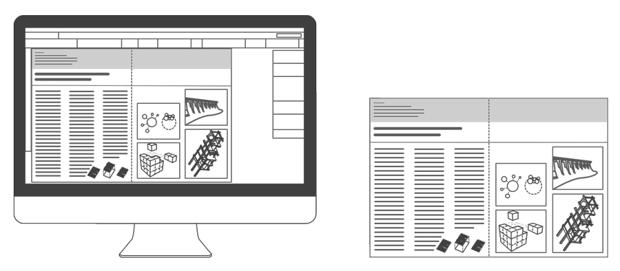
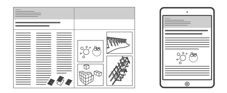
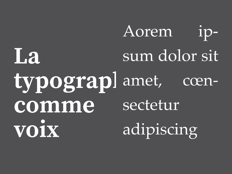
In reflowable EPUB, there are no fixed dimensions, so there is no pre-defined pagination, there is no vertical alignment, there are no full-bleed images or footnotes.
The content reflows according to the size of the screen, the content flows continually and not fragmented, paragraphs and images are solid blocks and it is not really possible to place certain elements arbitrarily.
In fact, There is nothing in rendering engines to handle pagination at the moment. Pagination is a hack, a hack made using CSS tools built for other purposes.
Modern reading systems often use CSS columns to emulate pagination. The problem is that this specification was never designed for this, and has not evolved to allow cases of digital book uses.
The designer does not make pages, but only gives suggestions. We must forget the concept of WYSIWYG (what you see is what you get).
For developers, make everything work
Rendering EPUB is a somewhat complex process in that page a arbitrarily defined layout can create many problems. It is thus rare that Reading solutions “overload” styles to set display bugs.
This is referred to as override, or a dynamic replacement of one or more styles of the EPUB file. In other words, it is as if the developers of the reading reading did not take into account or overstep certain layout indications.
It should be noted that these overrides are rarely arbitrary; They most often solve real problems: Truncated images or text, bad display of certain fonts, huge margins on small screens, etc.
In addition, some reading systems use overrides to restore functionality which may have been disabled by a designer’s CSS.
It must be understood that Never the same result everywhere, we must forget the “pixel-perfect” layout. On the one hand, the rendering engines are quite unable to layout identically. On the other hand, the reading systems manage these contents differently.
We must accept the loss of control…
The designer proposes, the user disposes
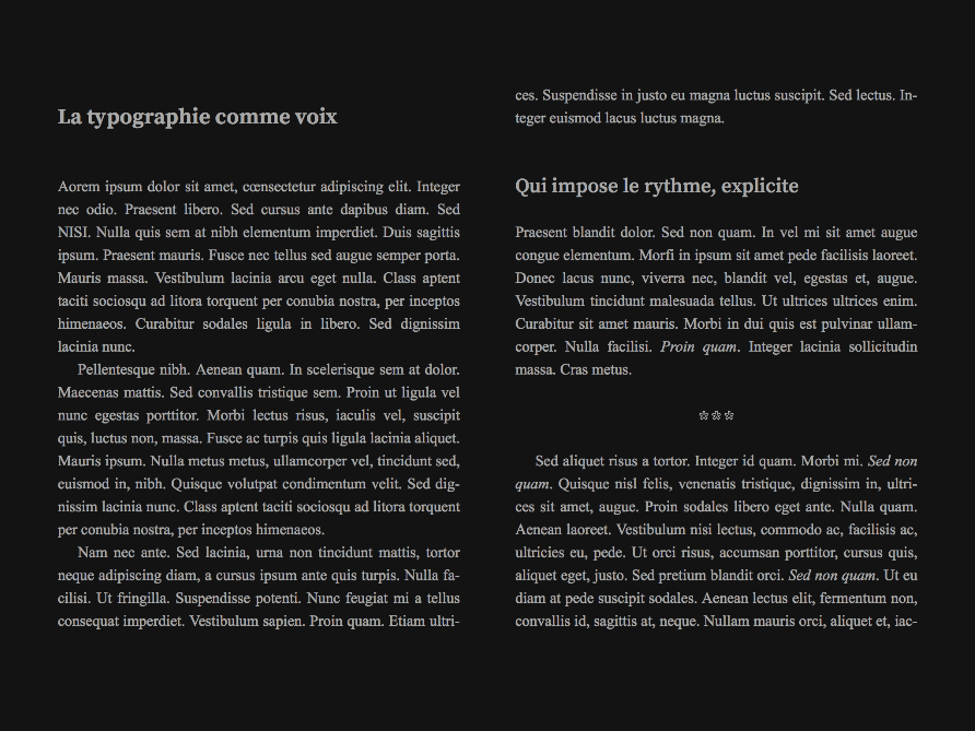
This loss of control is even greater, as users expect to change the display of the content.
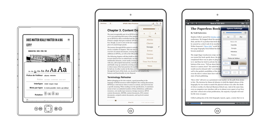
Since the very beginning of the digital book Compose the text at their convenience: Font and character size, background color, page margins, leading and aligning text are all variables on which they can work
We can design these user settings as a second category of overrides, which further complicates the task of the developers of reading solutions.
Note that the styles generated by DTP software often "break" certain user settings. The reader may therefore end up with illegible text in night mode, fonts not replaced for italics or a setting that does not work at all.
The reading experience
Designing a digital book, no matter how simple, goes well beyond the scope of design and layout.
We must think in terms of the reading experience.
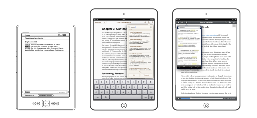
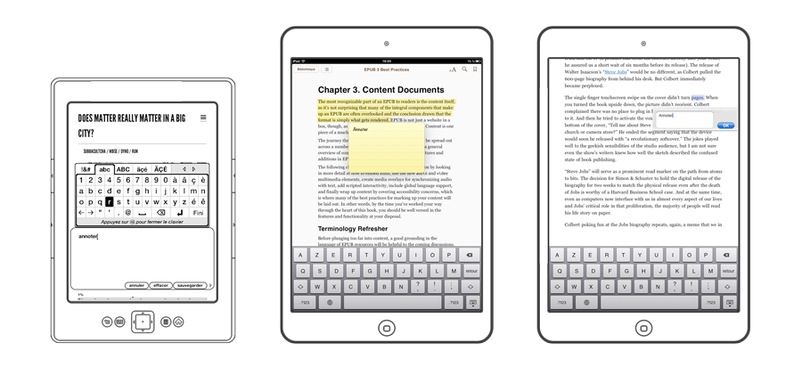
Reading systems provide many functions to help the reader:
- Access to the table of contents
- The ability to search the text
- Word definitions and online search for phrases
- Annotations
- Sharing
- Zooming images or tables
- Pop-up notes
- Viewing the only images the book contains (Kindle)
- etc.
This is not without posing some design challenges… How to ensure that you do not interfere with these features? How can we overcome these to bring others, which can improve the user's reading experience?
Only the calls of notes can already degrade this experience. Not linked, they will not allow access to the end-of-section note; Too small, they will ask the user to take it back several times before reaching it on his tactile device.
As for the more complex interactions, The support of the JavaScript language is not obligatory in EPUB, it will be necessary to compose with this constraint and to propose a static backup solution for each interaction.
Loss of control, range of possibilities
If we take stock, it must be admitted that the redistributable digital book can disarrange many publishers and graphic artists who are familiar with the jousting of publishing.
You have to look at things differently, lose certain habits, Re-think the usability of the printed object for the screen, create new design methods adapted to the constraints of this new medium…
As the web has already gone through this, we can draw an important lesson from it: we have to embrace the idea that All the solutions of reading are not equal in support and technical possibilities.
The answer is probably the concept of progressive enhancement: We build a solid base that works everywhere, and then enhance it according to the capacities of the reading environment.
Today, we are able to simulate vertical alignment, force an image to fragment a paragraph under certain conditions, or to dress it in a complex way, to make transformations on text (eg rotation) and create Adaptive composition grids.
Even better, CSS and JavaScript have mechanisms to design this progressive enhancement at best.
There is hope but it will require knowledge sharing, a lot of user research and, above all, a collective effort.